Dashboards that drive decisions (not just pretty charts)
How to build a dashboard people actually use to decide, the three questions a good one answers, and why most dashboards are expensive decoration.
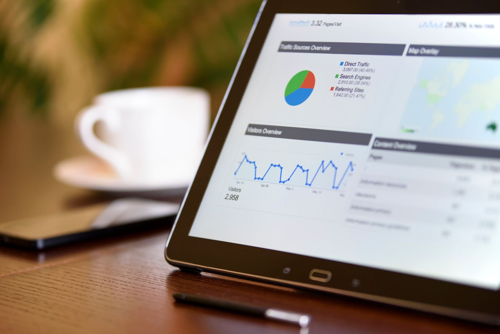
Almost every business has data; very few use it to decide. The data sits scattered across a sales tool, an accounting system, a spreadsheet, impossible to see at a glance. So decisions get made “by feel,” when there’s information underneath that would say something different. A good dashboard fixes that, if it’s built to drive decisions rather than to look impressive. And most aren’t. Let me show you the difference.
Report and dashboard aren’t the same thing
People confuse these constantly. A report is a snapshot of a moment, last month’s close, the quarter’s sales. You generate it, read it, file it. A dashboard is a live picture: the health of your business right now, updating on its own, that you check whenever you want.
Both are useful, for different jobs. A report is for reviewing the past; a dashboard is for operating the present. The expensive mistake is asking for a dashboard when you needed a report, or the reverse, and ending up with a tool nobody opens.
The trap: vanity metrics
Here’s the number-one failure: filling the screen with numbers that look impressive but change no decision. Total visits, followers, “activity”, they go up, they look nice, and they don’t tell you what to do differently tomorrow. Those are vanity metrics: they make you feel good, not decide better.
A metric only earns its place if, when it moves, you’d actually do something different. If a number changes and your reaction is “huh, interesting” and you carry on, it shouldn’t be on your dashboard. It’s taking up space and hiding what matters.
The three questions a good dashboard answers
This is the test I use to design a dashboard people actually use. A good one answers, at a glance, three questions:
- How am I doing? The pulse of the business today against your goal, sales, cash, whatever your vital sign is.
- What changed? What moved versus before, up, down, out of the ordinary, so you spot what needs attention fast.
- Where do I look now? What needs action today: a customer to chase, stock to reorder, a target at risk.
If your dashboard answers those three, it helps you decide. If it’s a gallery of pretty charts that lead to no action, it’s expensive decoration. Everything that doesn’t answer one of those three, cut it.
Fewer charts, better decisions
The temptation is to add everything “just in case.” It’s exactly backwards. A dashboard with forty indicators doesn’t get read; it gets ignored. One with the five or six that actually move your business gets checked every day.
The discipline of leaving things out is the hardest and most valuable part. Every number you remove makes the ones that remain more visible. A good dashboard isn’t the one that shows the most, it’s the one that tells you what to do fastest.
A dashboard is only as good as its data
Here’s where most dashboards fail: if your information lives scattered across tools that don’t talk to each other, building the dashboard becomes manual work nobody sustains. Updating it by hand every week is the number-one reason dashboards get abandoned. A good one almost always starts earlier, connecting the sources so it feeds itself. Connected, reliable data is the foundation, without it there’s no dashboard that stays alive.
From a mirror to a starting point
Once your numbers live connected and trustworthy, something bigger opens up: you can act on them, not just look. Alerts when something goes out of range, reports that assemble and send themselves, decisions that trigger without anyone watching. The dashboard stops being a mirror and becomes the starting point for automation. That’s when data stops being a report you read and becomes a system that works for you.
How we approach it
At AppsColombia we don’t start by asking “what charts do you want?” but “what decisions do you need to make?” From there we choose what to measure, little and actionable, and where to pull each number so the dashboard feeds itself instead of being updated by hand. We build it on your real systems, part of the custom software we build. If you want to stop deciding by feel and start deciding with data, let’s talk.
Conclusion
Having data isn’t the same as using it. A dashboard works when it answers three questions, how am I doing, what changed, where do I look now, and when every number it shows would lead to a different action if it moved.
Measure little and actionable, leave the vanity metrics out, and make sure it feeds itself from connected data. A good dashboard doesn’t give you more numbers; it gives you better decisions, faster.